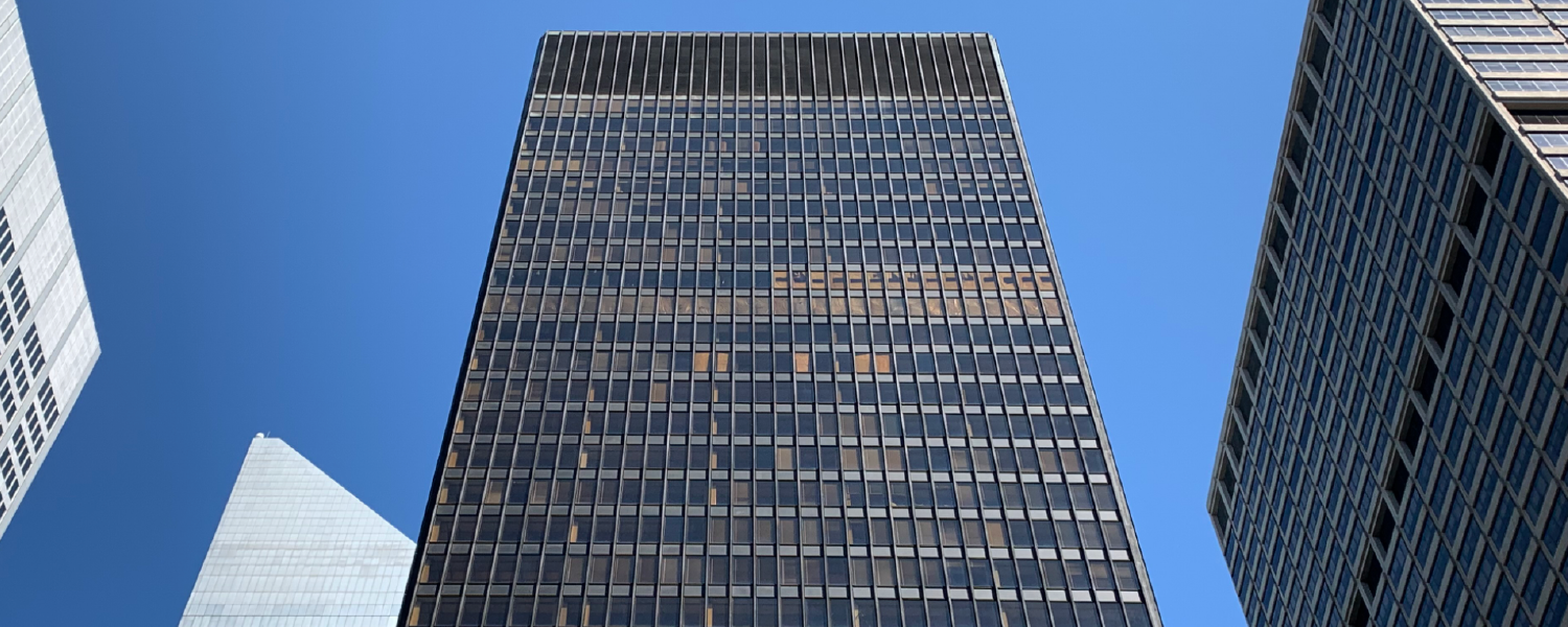
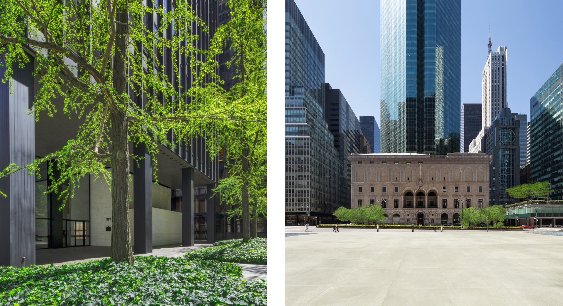
The Seagram Building wasn’t just another corporate tower rising on Park Avenue in 1958, it was a revolution in glass and steel. At 38 stories and 515 feet tall, this bronze-and-glass skyscraper broke away from New York’s wedding-cake-style towers, creating a sleek, disciplined presence that redefined what a modern office building could be. For architects, interior designers, home builders, developers, and realtors across the United States, this landmark remains one of the most important lessons in design: that clarity and restraint can be more powerful than ornament.
Context and Team: Seagram Building, The Vision That Changed Park Avenue
Seagram Building Location and Key Facts
-
Address: 375 Park Avenue, between 52nd and 53rd Streets, Midtown Manhattan.
-
Height: 515–516 feet.
-
Floors: 38.
-
Completion: 1958.
The Protagonists
The genius behind the Seagram Building architecture was Ludwig Mies van der Rohe, whose “less is more” philosophy was put to the ultimate test here. Philip Johnson designed the interiors, while Severud Associates managed structural engineering. And then there was Phyllis Lambert, daughter of Seagram’s CEO Samuel Bronfman, who convinced her father to hire Mies after rejecting an uninspired earlier design. Without her persistence, the story of modern skyscrapers might look very different.

Form, Skin, and Detail: The Language of Modernism
The Perfect Box (Without Setbacks)
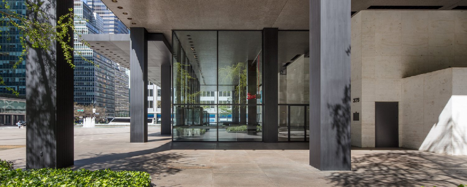
Unlike other New York skyscrapers that followed setback rules, the Seagram voluntarily stepped back 90 feet from the street, creating a dramatic plaza in front. The result? A bronze-and-glass slab that looked nothing like the ornate masonry towers of earlier decades.
Curtain Wall and Bronze: A Defining Feature of Seagram Building Architecture
The tower introduced a new kind of curtain wall: non-structural glass framed by vertical bronze mullions and horizontal spandrels of Muntz metal. Because fire codes required the steel frame to be encased in concrete, Mies added decorative bronze I-beams to the facade, visually expressing the building’s structural rhythm even if they weren’t actually load-bearing.
Uniform Blinds
Mies hated visual chaos. To prevent random blind heights from breaking the building’s order, he mandated blinds that only opened in three positions: fully open, halfway, or closed. It was a small detail with a big impact, preserving the tower’s elegant rhythm.
Topaz Glass, Travertine, and Marble
Far from cheap minimalism, the Seagram Building architecture was crafted with premium materials: topaz-tinted glass, bronze, travertine, and marble. The richness of these materials turned restraint into luxury.
Engineering Behind the Seagram Building: Where Elegance Meets Strength
Mixed System and Firsts
Beneath its sleek surface, the Seagram introduced several engineering firsts:
-
A steel moment frame combined with a reinforced concrete core for lateral stability.
-
Shear walls rising to the 17th floor.
-
Shear trusses bracing up to the 29th floor.
-
The first tall building to use high-strength bolted connections.
-
One of the earliest to combine a braced frame with a moment frame.
Lessons for Today from the Seagram Building
These details matter not just historically but for modern practice: precision, modularity, and foresight in maintenance are what separate enduring architecture from disposable construction.
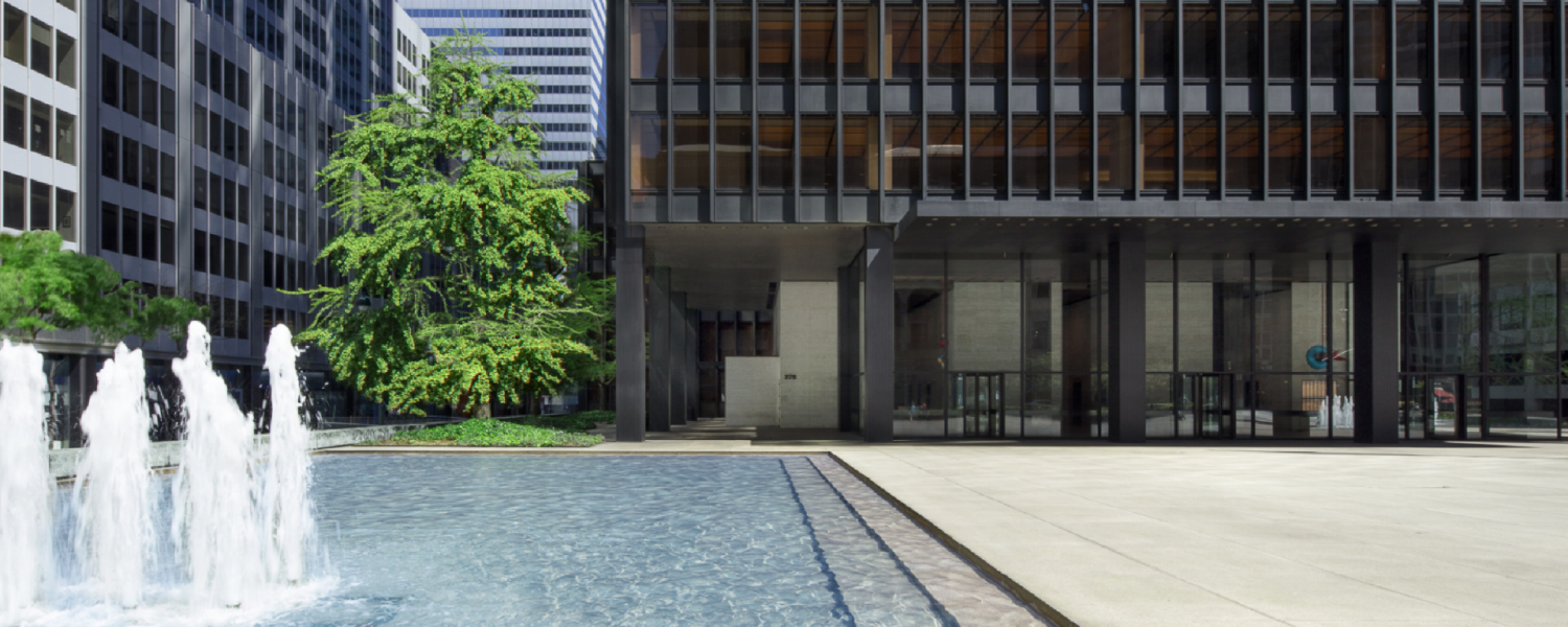
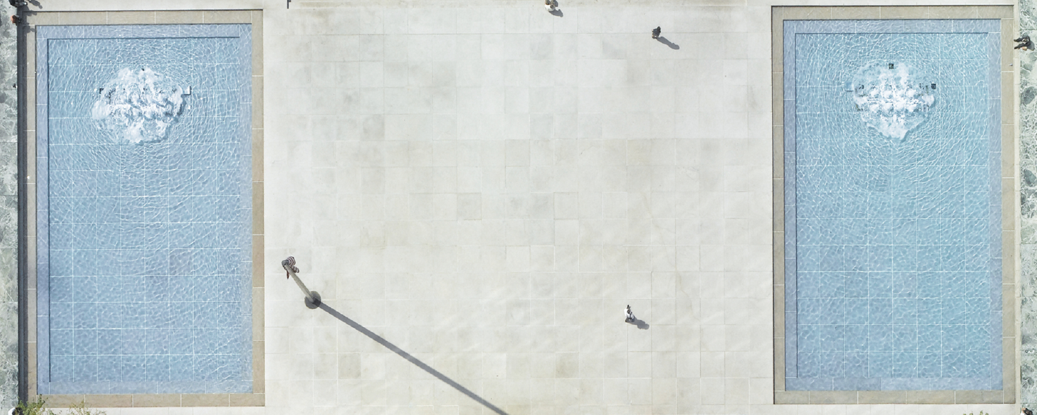
The Plaza: Corporate Urbanism as Civic Space
Composition and Experience
The pink granite plaza is as iconic as the tower. With its two fountains, tree beds, and subtle steps, it creates a space where the city slows down. The setback transformed not only Park Avenue but also the way corporations thought about their civic role.
From Masterpiece to Policy
The plaza inspired the 1961 Zoning Resolution, which allowed extra building height in exchange for publicly accessible plazas. The concept of Privately Owned Public Spaces (POPS) began here.
Real Use vs. Design Intent
Urbanist William H. Whyte studied how people actually used the plaza. His film The Social Life of Small Urban Spaces revealed the lively, human scale of the design—proving that good architecture adapts to people’s behavior.
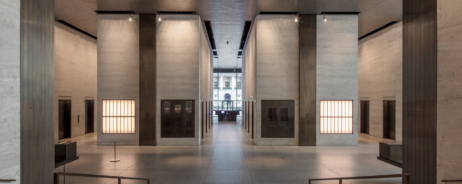
Interiors That Teach: Light, Furniture, and Corporate Rhythm
Lobby as Extension of the Plaza
The lobby was conceived as part of the plaza, with travertine walls, luminous ceilings, and a clean transition into the elevators. No grand gestures—just understated elegance.
Modular Offices and Luminous Panels
Office floors were designed with modular flexibility and luminous ceiling panels, allowing layouts to adapt over time. It was a corporate workspace decades ahead of its time.
Dining Icons
The building also housed iconic dining: the Four Seasons and Brasserie, now reimagined as The Grill, The Pool, and The Lobster Club. These spaces blended modernist design with cultural prestige, proving the building wasn’t just about offices.
Cost, Criticism, and Recognition: The Price of Perfection
The Most Expensive Skyscraper of Its Time
At $41 million, the Seagram was the most expensive skyscraper of its day. But the money went into materials, details, and consistency—every inch reinforced Mies’s vision.
Mixed Criticism
Lewis Mumford praised it as a “Rolls-Royce of buildings.” Ada Louise Huxtable called it “consummately elegant.” Frank Lloyd Wright, on the other hand, dismissed it as a “whiskey bottle on a playing card.” Love it or not, no one could ignore it.
Landmark Status
In 1989, the New York City Landmarks Preservation Commission designated the building’s exterior, lobby, and Four Seasons Restaurant as official landmarks. It was later added to the National Register of Historic Places in 2006.
Influence and Legacy: From Manhattan to the World
An Exportable Typology
The Seagram Building architecture quickly became the archetype for corporate skyscrapers. Unfortunately, many imitators produced cheap glass boxes that lacked its discipline and material richness.
A Cascade of Projects
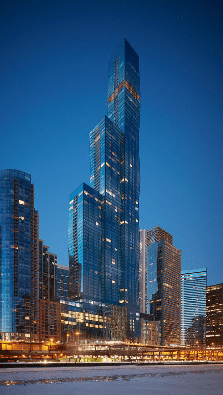
Lever House, 270 Park Avenue, the Inland Steel Building, and countless international towers all owe a debt to Seagram. Mies himself replicated elements in towers from Chicago to Toronto.
Recent Updates
Under Aby Rosen’s RFR Holding, the building has undergone careful restorations, including the Seagram Playground, a gym and communal space designed to keep the building relevant in a post-pandemic workplace.
Lessons for Architects, Interior Designers, and Developers from the Seagram Building
Clear hierarchy creates timeless form
The Seagram Building shows how a strong, simple hierarchy—tower above, plaza below—creates order that never feels outdated. By resisting clutter and unnecessary ornament, Mies established a visual balance that architects and developers can still rely on today. Good design isn’t about doing more; it’s about doing what matters with clarity.
Material honesty builds trust and beauty
Bronze mullions, travertine walls, and marble floors weren’t just about aesthetics, they communicated permanence and prestige in the Seagram Building. The lesson here is that authentic, durable materials elevate both the design and the brand behind it. When you choose finishes that age gracefully, you’re building not just for today, but for generations.
Lighting is design, not decoration
The luminous ceiling panels and topaz glass weren’t afterthoughts; they defined how people experienced space at the Seagram Building. Lighting guided the rhythm of work, softened transitions, and amplified the building’s elegant order. Modern projects can learn that lighting isn’t just functional, it’s one of the most powerful design tools available.
Modularity enables flexibility
The office floors were designed with modular systems, allowing tenants to adapt layouts without losing harmony. This foresight turned the Seagram into a long-term investment, not just a flashy tower. For today’s architects and developers, modularity means resilience, spaces that can change as people’s needs evolve.
Seamless transitions connect indoors and outdoors
The plaza, steps, and lobby function as one continuous experience. By blurring the line between public and private, Mies gave the city a gift while enhancing the building’s prestige. Every project benefits from thinking about thresholds: how do people feel when they move from street to space?
Details matter more than you think
From window blinds with only three positions to the bronze I-beams that suggested structural order, every detail served the larger vision. Small design decisions communicate discipline, and when done right, they make the entire project feel more intentional and professional. Cutting corners on details is cutting corners on trust.
Plazas aren’t empty space, they’re social catalysts
The Seagram Building’s plaza wasn’t “lost” real estate; it became one of Manhattan’s most used and studied public spaces. It showed how open areas add cultural and economic value to a project. For today’s developers, investing in plazas, courtyards, or shared amenities isn’t generosity, it’s smart business.
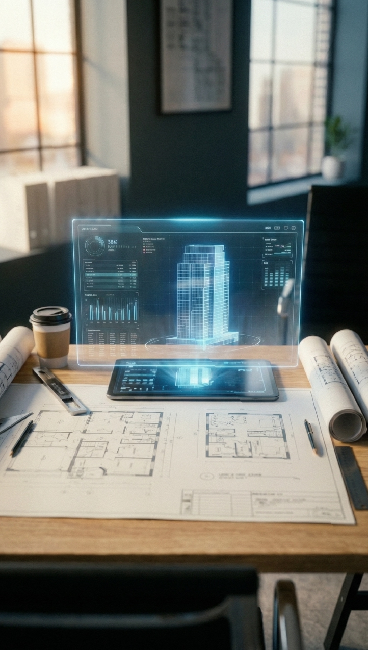
Visualize Before You Decide: The Power of 3D Simulation
How We Would Approach It Today
If the Seagram were designed today, architects would model everything in 3D:
-
Interior renderings to test how bronze reflects light.
-
Day vs. night simulations to study plaza use.
-
Facade mockups in CGI to analyze joints and weathering.
If you want to bring the same level of rigor to your own projects, don’t leave it to guesswork. Explore our 3D Rendering Services here.
If you want to learn more about the Seagram Building, visit the official website here.