Walk into a hospital waiting room and you’ll notice something right away: it’s not painted in fire-engine red. Instead, you’ll find calming greens or cool blues. Now step into a Google office, and suddenly you’re surrounded by splashes of orange, vibrant blues, and energizing yellows. These aren’t random paint jobs. They’re carefully chosen strategies grounded in Color Psychology in Architecture.
The truth is simple: color isn’t just decoration. It’s science, emotion, and strategy rolled into one. As architects, interior designers, home builders, and realtors, we hold in our hands one of the most powerful tools for shaping human experience: color.
This article will take you on a journey through the fascinating world of Color in Architecture—how it influences mood, how it can change the way we perceive space, and how architects throughout history have used it to communicate identity, culture, and emotion.
Why Color Psychology in Architecture Matters More Than You Think
We spend more than 90% of our lives indoors, which means the colors that surround us are constantly at work on our nervous system. Research shows that warm tones like reds and oranges can increase heart rate and cortisol levels, while cool tones like blue and green help us relax and focus.
-
Physiological impact: Within minutes of entering a red room, your body shows measurable changes in blood pressure and energy levels.
-
Psychological impact: Blue rooms promote calm and focus, while yellow brings energy and optimism.
Hospitals that integrated color strategies reported a 70% drop in patient anxiety, and offices that experimented with color zoning saw up to 18% improvements in productivity. That’s the power of thoughtful Color in Architecture—it’s not just aesthetic; it’s performance-driven.
The Basics of Color Theory in Architecture
Before diving into applications, let’s ground ourselves in Color Theory in Architecture. At its core:
-
Primary colors: Red, blue, yellow.
-
Secondary colors: Orange, green, purple.
-
Tertiary colors: Combinations of the above.
Architects often rely on three major color schemes as the foundation for design decisions. Each one has a different psychological impact and practical use in architecture:
-
Monochromatic: This scheme uses variations of a single color—different tones, tints, and shades—to create a sense of unity and sophistication. For example, a lobby designed in layers of blue, from soft sky tones to deep navy accents, can feel calm yet dynamic. Monochromatic palettes are particularly effective in minimalist projects or spaces where texture and lighting take center stage.
-
Analogous: These schemes combine colors that sit next to each other on the color wheel, such as blue, teal, and green. Because they share undertones, they naturally create harmony and flow. Architects use analogous palettes in environments that need a soothing, cohesive mood—like healthcare facilities or residential interiors—where subtle transitions between colors can feel more organic and connected to nature.
-
Complementary: This strategy pairs colors from opposite sides of the wheel, like orange and blue or red and green. Complementary palettes are bold and high in contrast, immediately catching attention. In architecture, they’re often used to highlight specific elements—an accent wall, a façade detail, or a piece of furniture—because the tension between the hues makes each color stand out more vividly. When applied thoughtfully, complementary schemes bring vibrancy and energy without overwhelming the space.
Lighting conditions dramatically change how we perceive color. A shade that looks soft and warm under daylight can feel sterile or even cold under fluorescent lighting. That’s why Newton’s discovery—that white light refracts into a full spectrum—still echoes in design today. Architects must always consider the marriage between light and color.
By understanding and applying these schemes, architects can shape not just the aesthetics but also the emotional tone of a space, making Color Theory in Architecture an essential design tool.
If you’d like to explore and experiment with color relationships more interactively, we recommend visiting Canva’s Color Wheel, a helpful tool to understand harmony, contrast, and balance in color design.
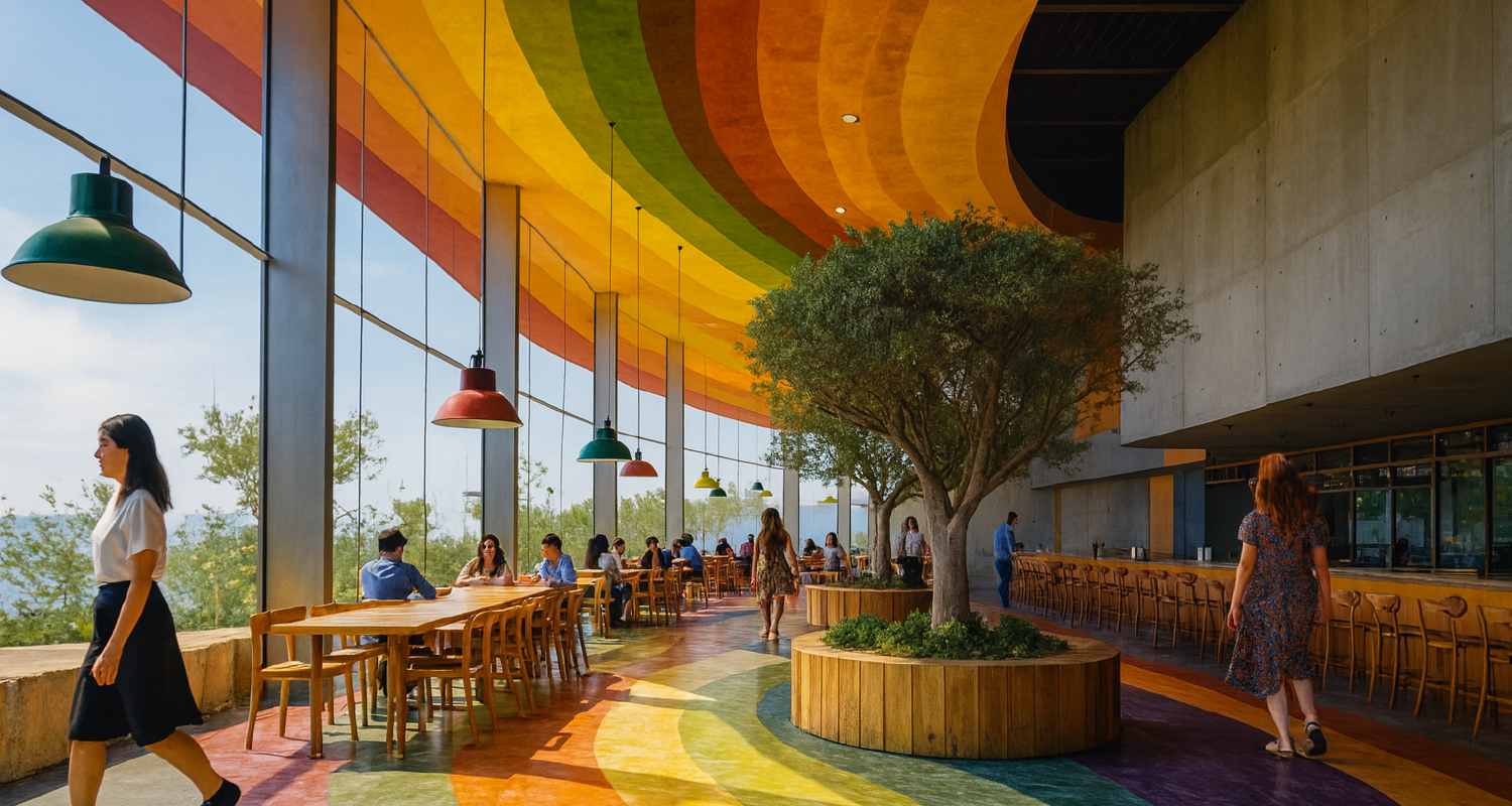
How Different Colors Influence Mood and Space
Before we dive color by color, remember that response to color hinges on four levers you control as a designer: light (daylight vs. electric, CCT/CRI), chroma (intensity/saturation), value (lightness/darkness, often expressed as LRV), and finish (matte to gloss). Material also matters—paint, wood, stone, tile, textiles, and metal reflect and diffuse color differently. With that frame, here’s a practical, architecture-first guide you can apply on real projects.
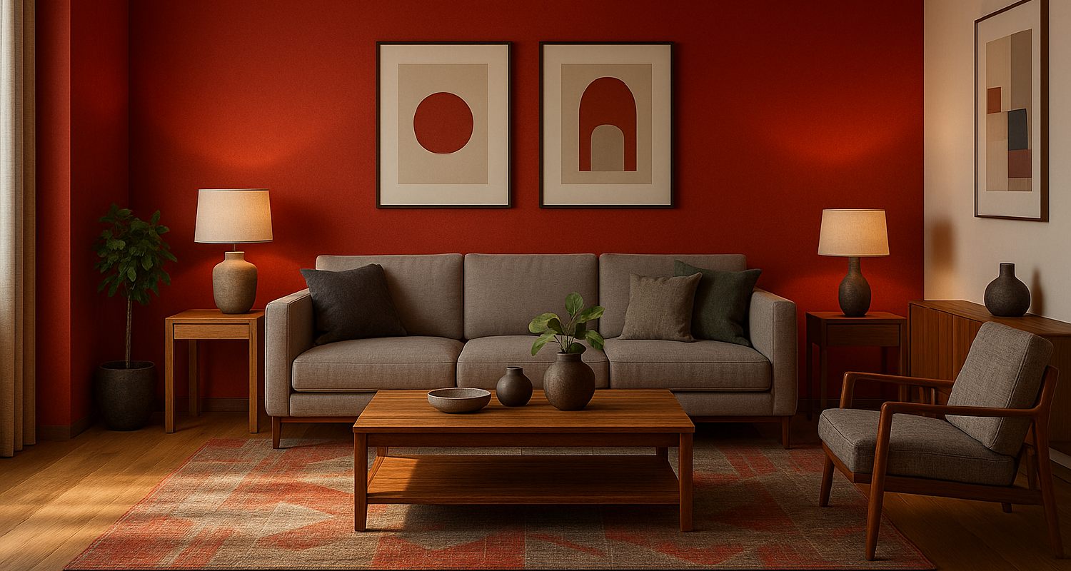
Red
Psychological effect: Heightens arousal, urgency, and attention. Small doses can feel warm and luxurious; large, saturated fields can read as aggressive or fatiguing.
Spatial behavior: Perceptually “advances” toward the viewer; brings planes forward and compresses depth.
Best uses: Accents in hospitality and retail to drive wayfinding and micro-moments (checkouts, feature walls, signage). In workplaces, reserve for collaboration zones, not heads-down areas.
Placement tips:
-
-
Walls: limit to ≤10–15% of visible surface area to avoid visual overload.
-
Ceilings: generally avoid—red overhead feels heavy and intrusive.
-
Floors: only as pattern accents or rugs; full-field red floors can induce restlessness.
Lighting notes: Warm lighting (2700–3000K) intensifies red; cool lighting (4000–5000K) can dull it.
Pairings: Calm it with desaturated greens, muted grays, or warm woods.
Avoid: High-gloss red on large planes; it amplifies glare and visual fatigue.
-
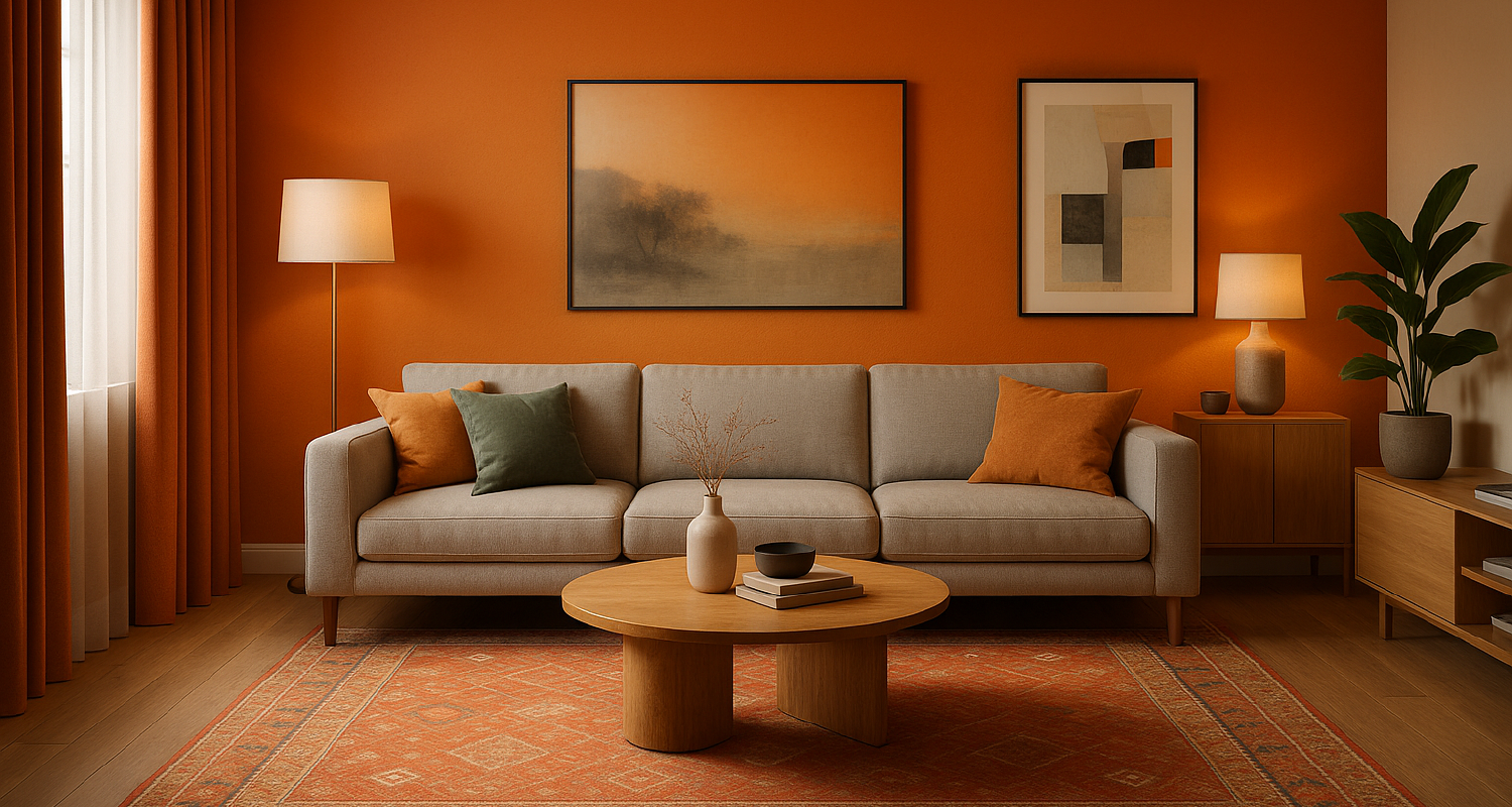
Orange
Psychological effect: Sociable, upbeat, and energetic without the sharpness of red.
Spatial behavior: Slightly advancing; adds warmth and perceived activity.
Best uses: Creative studios, school commons, café counters, informal meeting lounges.
Placement tips: Great for millwork, upholstery, and wayfinding bands; use mid-chroma tones to avoid a “fast-food” feel.
Lighting notes: Sun-washed spaces (south/west) can push orange toward overly hot; balance with cooler neutrals.
Pairings: Teal/blue-gray for sophisticated contrast; light oak or maple for a fresh, contemporary look.
Avoid: Low-saturation oranges (muddy peach) in dim spaces—they skew dingy.
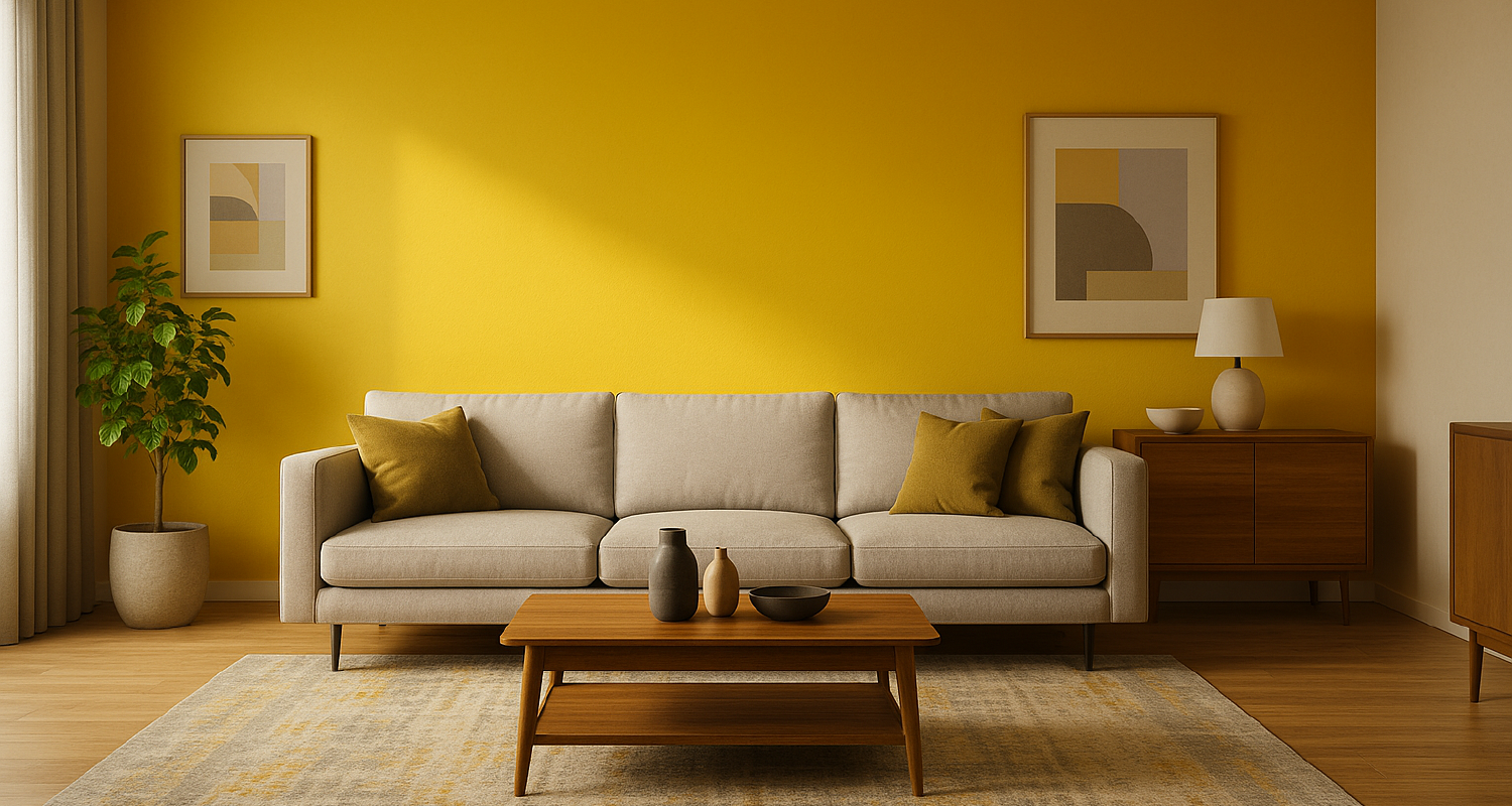
Yellow
Psychological effect: Optimism, clarity, and communication; high-chroma yellows can become irritable if overused.
Spatial behavior: Bright yellows appear to radiate; they lift value and perceived brightness.
Best uses: Entry lobbies, circulation cues, collaboration nooks, children’s areas. Excellent as a daylight amplifier in cloudy climates.
Placement tips:
-
-
Walls: prefer softer, creamy yellows (higher LRV, lower chroma) for large areas.
-
Ceilings: pale yellow can “raise” a low ceiling visually.
-
Accents: saturated yellow works well in small elements (graphics, furniture).
Lighting notes: Fluorescent/low-CRI sources can make yellow look sickly; specify high-CRI LEDs.
Pairings: Charcoal, deep navy, or walnut ground yellow and prevent glare.
Avoid: Pairing high-chroma yellow with glossy white everywhere—eye strain and sterile glare.
-
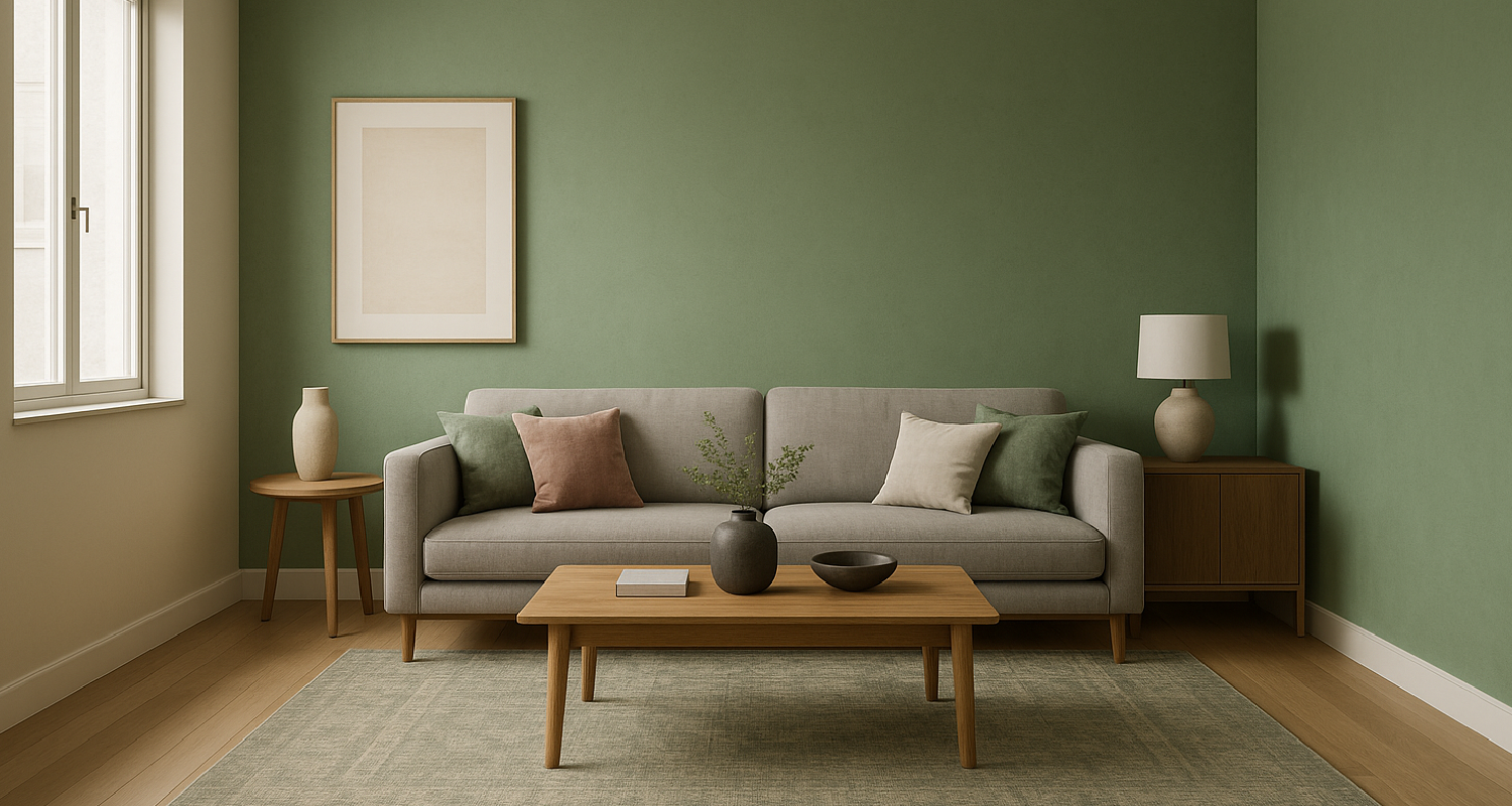
Green
Psychological effect: Restorative, balanced, associated with nature and health; the most restful hue for the eye.
Spatial behavior: Neutral to receding depending on value; mid-greens feel steady and grounded.
Best uses: Healthcare recovery rooms, wellness areas, libraries, focus zones, biophilic lobbies.
Placement tips:
-
-
Walls: sage, olive, and moss read sophisticated and timeless.
-
Ceilings: pale green tints can soften glare in high-daylight spaces.
-
Floors: desaturated green terrazzo or carpet tiles reduce visual fatigue.
Lighting notes: Cool daylight can push some greens toward cyan; test samples under final lighting.
Pairings: Stone, linen, and bronze; desaturated pinks (dusty rose) for a modern complementary palette.
Avoid: “Electric” greens on large fields in patient care or offices—too stimulating.
-
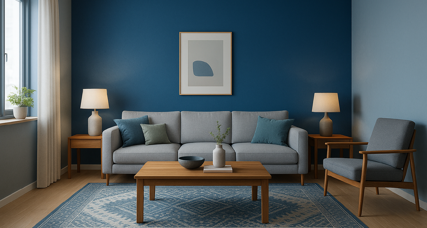
Blue
Psychological effect: Trust, focus, and calm; dark/navy can become formal or cold if not balanced.
Spatial behavior: Generally receding; expands perceived depth and supports concentration.
Best uses: Banks and corporate areas, study rooms, deep-work zones, bedrooms.
Placement tips:
-
-
Walls: mid-value blues (steel, cadet) are workhorses for productivity.
-
Ceilings: pale blue can visually “lift” a room and cool overly warm daylight.
-
Accents: pair brighter blues with warm textures to avoid sterility.
Lighting notes: High-CCT light (≥4000K) can make blue feel clinical; blend with 3000–3500K for balance.
Pairings: Walnut, cognac leather, and brushed brass to add warmth and sophistication.
Avoid: All-blue schemes with cool lighting and glossy white floors—perceived coldness and glare.
-
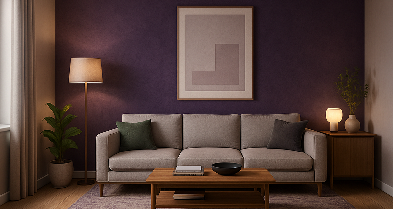
Purple
Psychological effect: Dignity, introspection, and a quiet sense of luxury; can turn pompous or somber at high chroma/dark values.
Spatial behavior: Heavy in dark tones; ethereal in pale lavenders.
Best uses: Cultural institutions, contemplation rooms, boutique hospitality, galleries.
Placement tips: Keep it textural—velvet upholstery, patterned wallcovering, or mineral paints—rather than large, flat painted fields.
Lighting notes: Mixed lighting can shift purple toward magenta or blue; mock up under final spectra.
Pairings: Soft grays, desaturated greens, aged brass; avoid stark white which can cheapen the effect.
Avoid: Full-field dark purple walls in small rooms—oppressive.
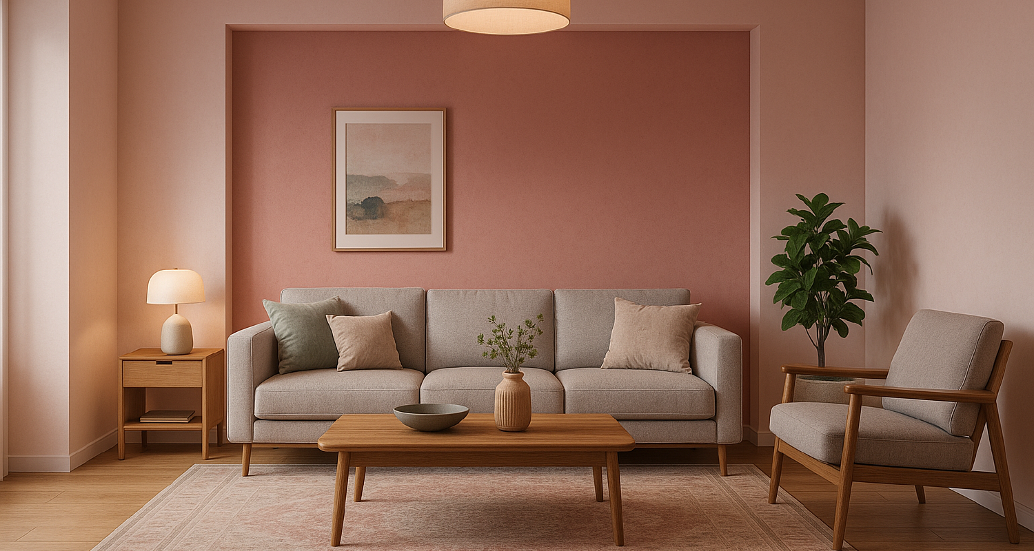
Pink
Psychological effect: Calming, intimate, and approachable; bolder corals feel lively and social.
Spatial behavior: Warms skin tones; subtly advancing.
Best uses: Hospitality suites, residential lounges, boutique retail, wellness spaces.
Placement tips: Choose grayed-off blush/rose for sophistication; reserve bubble-gum tones for branding accents only.
Lighting notes: Warm LEDs enhance pink pleasantly; cool light can make it look chalky.
Pairings: Oxidized green, walnut, travertine, smoked glass.
Avoid: Over-sweet palettes without texture—introduce stone/wood to ground it.
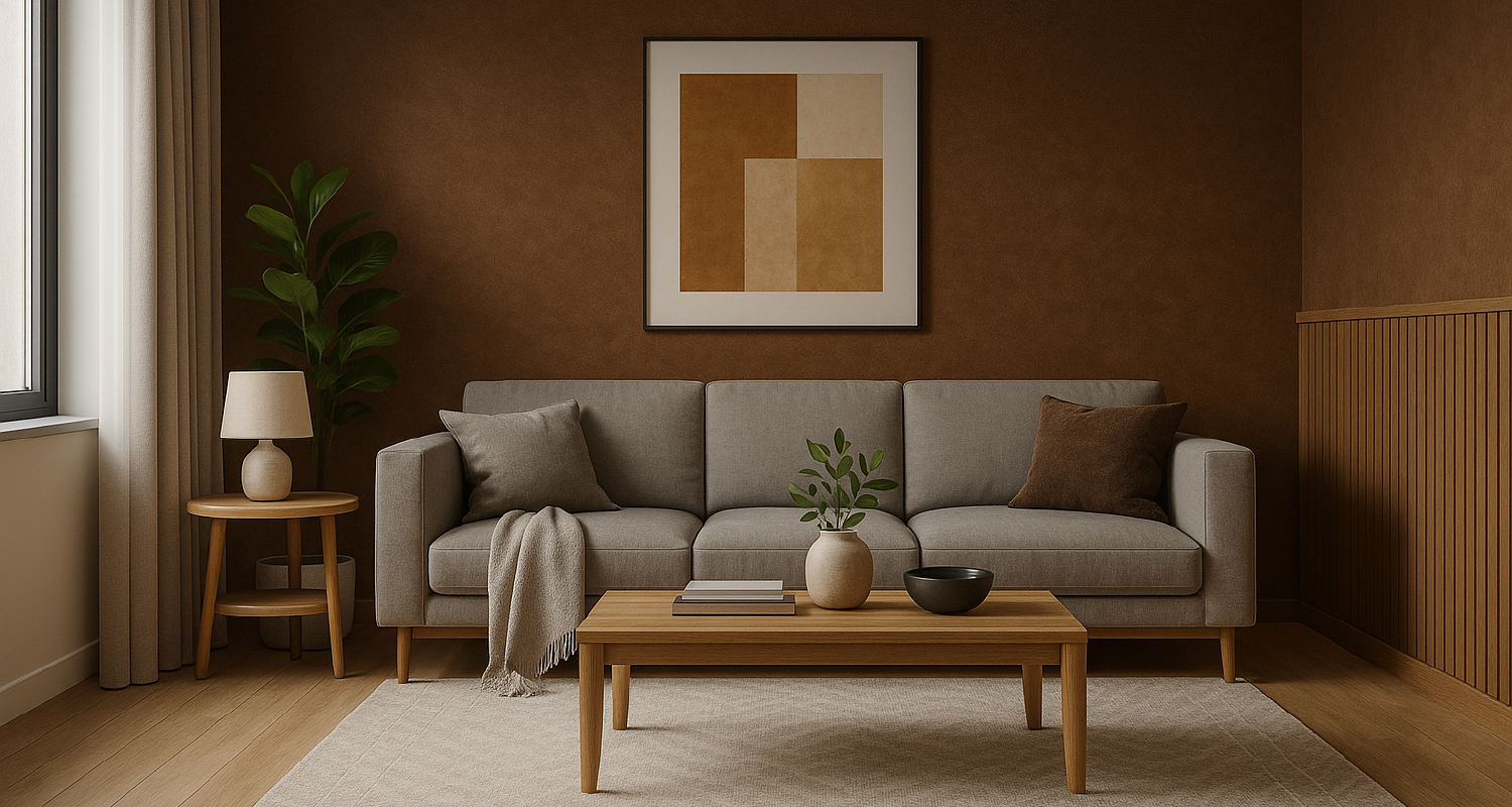
Brown, White, Gray & Black (Neutrals That Do the Heavy Lifting)
Brown
Effect: Stability and warmth when expressed through natural materials; painted brown can feel flat or oppressive.
Use it: As real material—walnut paneling, clay tile, rammed earth, bronze—rather than paint.
Avoid: Large planes of mid-brown paint; choose textured finishes instead.
White
Effect: Amplifies light, simplifies form, and cleans visual noise; in excess, reads sterile.
Use it: Ceilings (high LRV) to diffuse light; contrast backdrop for art or strong materials.
Balance: Add texture (limewash, microcement), warm woods, and layered lighting to avoid glare.
Avoid: All-white + high gloss + high CCT = visual fatigue.
Gray
Effect: Neutral, controlled, professional; can deaden a space if overused or too cool.
Use it: As a spectrum—warm grays (greige) for hospitality/residential, cooler grays for tech/office with ample warmth elsewhere.
Balance: Pair with color accents, varied values, and tactile surfaces (bouclé, stone fluting).
Avoid: Single gray on every surface; creates flat luminance and eye strain.
Black
Effect: Drama, depth, and visual recession; can feel ominous at scale.
Use it: To hide ceilings/services, frame views, or ground a composition.
Balance: Layer warm light, soft furnishings, and reflective accents (patinated brass) to keep it inviting.
Avoid: Low ceilings entirely in black without compensating light—oppressive.
Color Psychology Across Building Types
Healthcare
Emergency departments benefit from energetic colors that keep staff alert. Recovery rooms rely on soft blues and greens to promote healing.
Education
-
Red enhances focus and precision for math and sciences.
-
Blue and green boost creativity in art and writing classes.
Schools that adopted these strategies saw test scores improve by up to 15%.
Workplaces
Analytical zones thrive with blues and greens, while creative and collaborative areas flourish with yellows and oranges. Some companies even use LED systems that shift hues throughout the day to support energy cycles.
Urban Projects
Color can revitalize entire communities. Superkilen Park in Copenhagen uses bold chromatic schemes to celebrate multicultural identity, while Kampung Pelangi in Indonesia turned a decaying village into a rainbow-colored destination.
Residential
Bedrooms with blues or soft earth tones promote sleep. Kitchens painted in warm tones encourage social interaction. Living rooms benefit from a neutral base with vibrant accents to balance energy and relaxation.
Cultural and Demographic Considerations
Color meanings aren’t universal. In the U.S., white symbolizes purity and cleanliness, but in many Asian cultures, it represents mourning.
Demographics matter too. Children often prefer bright, saturated colors, while adults lean toward softer, muted palettes. For architects working in multicultural or intergenerational contexts, sensitivity to these variables is critical.
Famous Architects Who Mastered Color
-
Luis Barragán: Known for vibrant hues that evoke spirituality and emotion. Casa Gilardi’s pink and blue walls are iconic.
-
Le Corbusier: Used primary colors to define space and function, famously in the Unité d’Habitation.
-
Frank Lloyd Wright: Integrated earthy palettes in Fallingwater, harmonizing with nature.
-
Ricardo Legorreta: Bold colors inspired by Mexican culture, infusing modernism with warmth.
Each of these architects understood that Color in Architecture is both identity and experience.
Designing With Color: Practical Tips for Architects and Designers
-
Treat color as language: it doesn’t just decorate; it communicates.
-
Use optical tricks:
-
Dark ceilings lower space.
-
Painted side walls narrow it.
-
Full-color walls elongate a room.
-
-
Pair color with natural materials like wood or stone for balanced emotional impact.
-
Apply visual ergonomics: avoid extreme contrasts that strain the eyes and reduce productivity.
The Future of Color Psychology in Architecture
We’re moving toward an era where color is not static.
-
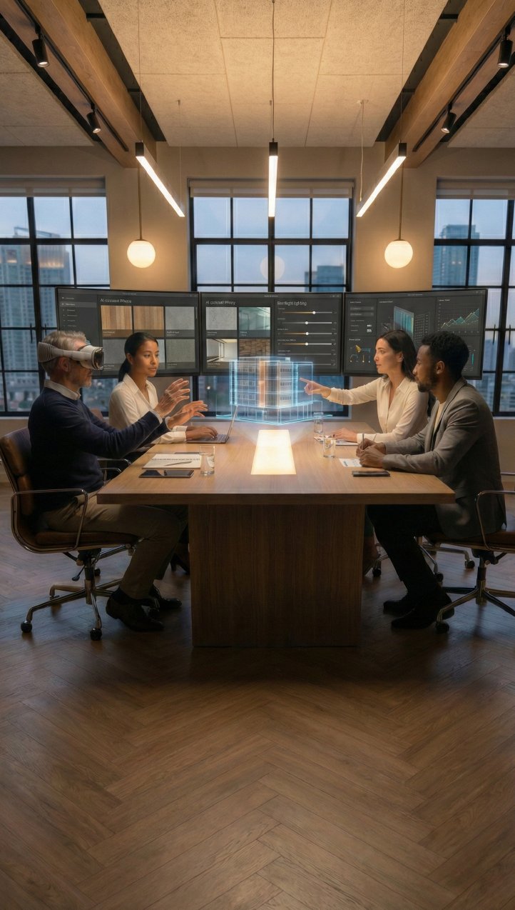
VR and AR tools now let architects and clients test palettes before building.
-
Circadian lighting systems adjust color temperatures throughout the day to align with biological rhythms.
-
Sustainable design increasingly uses lighter colors to reduce heat absorption and lower energy use.
The future of Color Psychology in Architecture is adaptive, responsive, and deeply tied to human well-being.
Bringing Color to Life With 3D Visualization
Architects no longer have to wait until walls are painted to know if a palette works. With 3D renderings and VR/360 tours, designers can test combinations under different lighting conditions and material finishes.
At Xpress Rendering, our team specializes in creating hyper-realistic visualizations that let you see how color will truly shape your project. From hospitals to luxury homes, we help architects and developers validate their ideas before a single nail is hammered.
Explore our services and discover how your next project can come to life with the right colors, get your quote here.
FAQs about Color Psychology in Architecture
-
What is color psychology in architecture?
It’s the study of how color affects emotions, behavior, and perception within architectural spaces.
-
How does color affect building design?
It influences how we feel in a space, alters our perception of size, and communicates identity.
-
Which colors are best for hospitals and schools?
Hospitals benefit from calming greens and blues; schools thrive with a balance of stimulating reds and creative blues.
-
Does culture change how we perceive color?
Yes. While physiological responses are universal (red raises arousal), symbolic meanings vary across cultures.
-
How can architects experiment with color safely?
Through 3D renderings and VR tours, which simulate real-world lighting and material conditions before construction begins.
Color psychology in Architecture: Conclusion
Color is far more than a finishing touch. It’s a scientific, emotional, and cultural force that defines how people experience architecture. From Wright’s earthy tones at Fallingwater to Legorreta’s bold Mexican palettes, history proves that Color psychology in Architecture is as vital as form and function.
The next time you step into a building, pay attention. The walls are speaking, and their language is color. As designers, developers, and builders, it’s our responsibility to choose wisely.
Are you ready to see how colors can transform your next project?